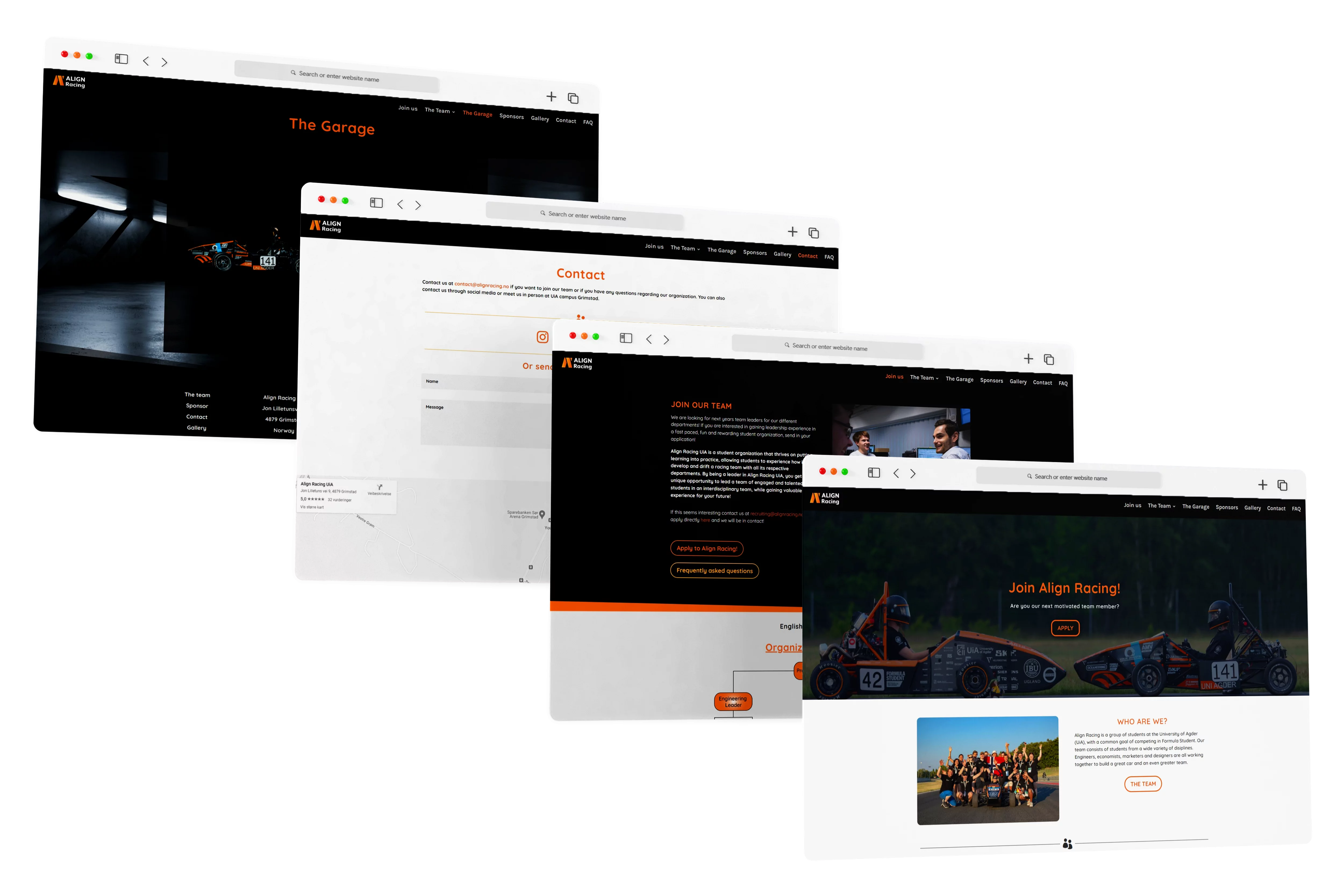

Website Redesign & Development Case Study
About The Project
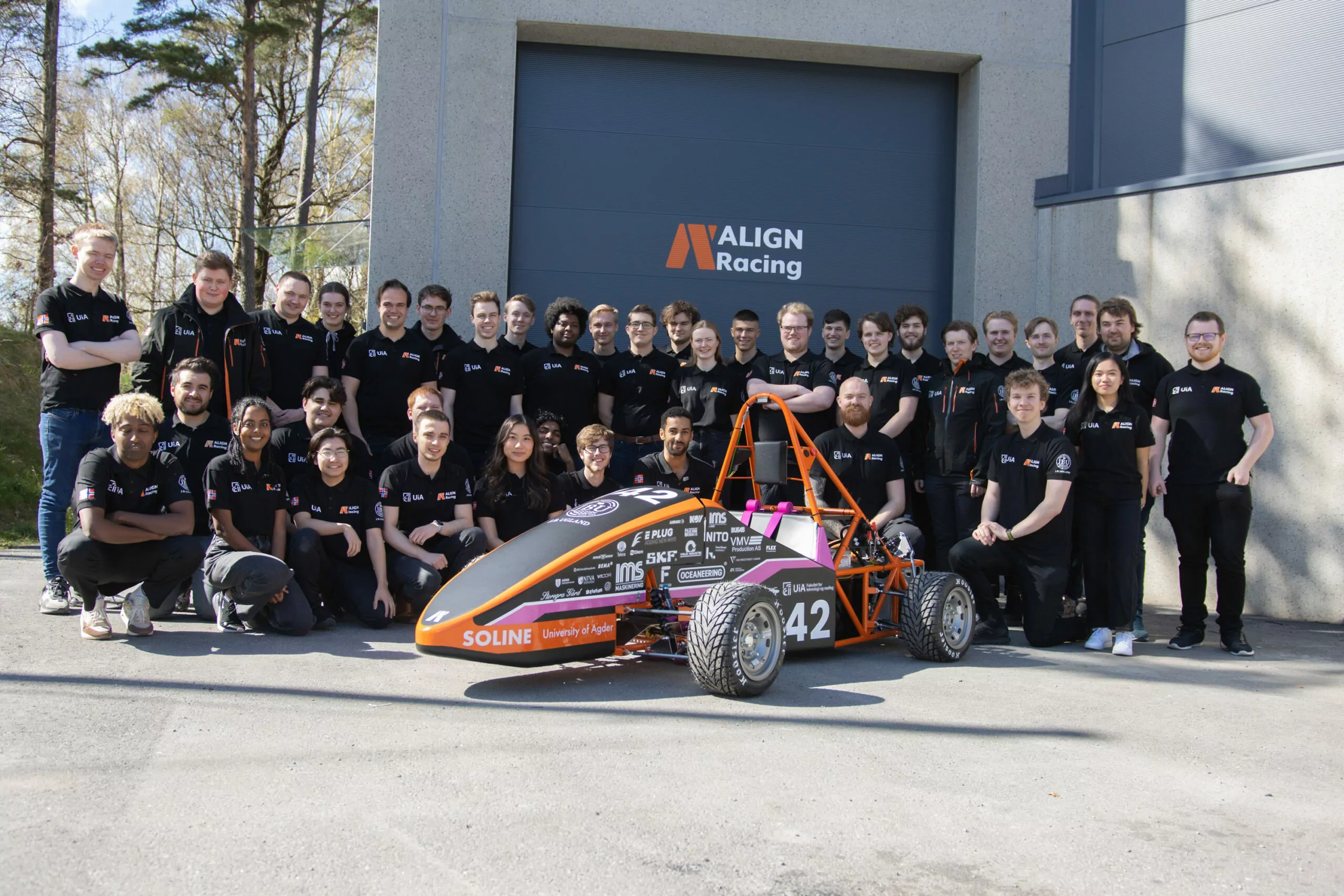
Align Racing is a non-profit student organization at the University of Agder (UiA), with a common goal of competing in the Formula Student competition.
Engineers, economists, marketers and designers are all working together to build a great car and an even greater team.
Tools
•Adobe XD
•Wordpress with Divi Builder
The Challenge
A total redesign of the Align Racing website with the goal of making it easier to apply for the organization with human centered design in focus.
My Role
As the Marketing Manager of the Align Racing team in 2022/2023, I assumed a dual role as both a UX Designer and Web Developer, responsible for translating and executing the design concepts into a functional website.
The Solution
I conducted thorough research and user testing on the website prior to the redesign process. This allowed me to identify and address the pain points experienced by real users. Based on these insights, I proceeded to revamp the site map, create prototypes, and ultimately implement the redesigned elements into the website.
Research
Target Audience
The primary user group identified through the research conducted ended up being students who want relevant work experience.
Problem Statement
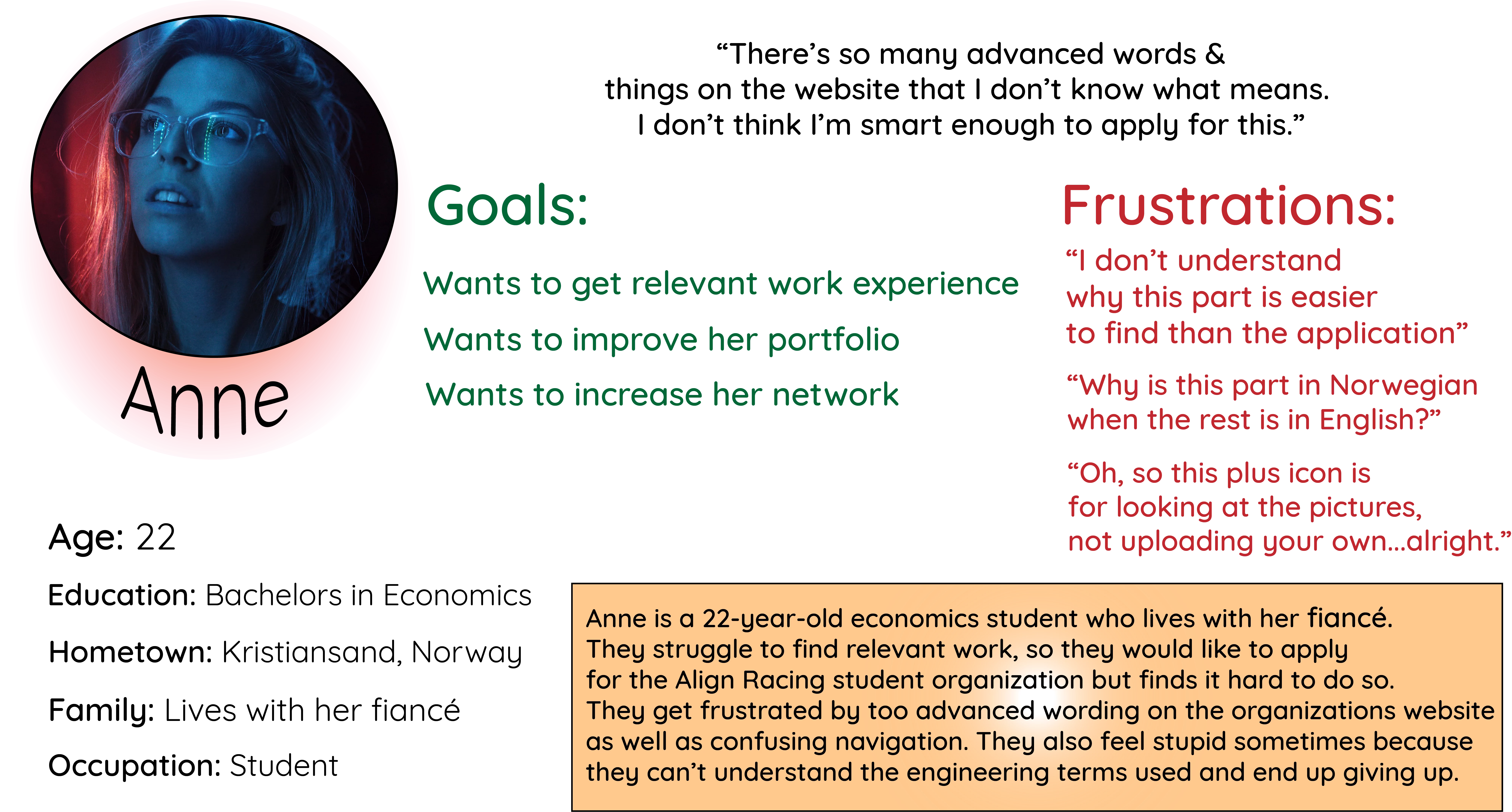
“Anne is a student who needs a more user-friendly navigation when navigating the websites of student organizations because she want to find where to apply in order to get relevant work experience”.
Personas
Personas were created for a realistic representation of the organization’s users.
Pain Points
Research revealed that the application page for the student organization is difficult to find, which leads to students giving up on trying to apply. This difficulty can directly affect the organization by loss of potential new members.
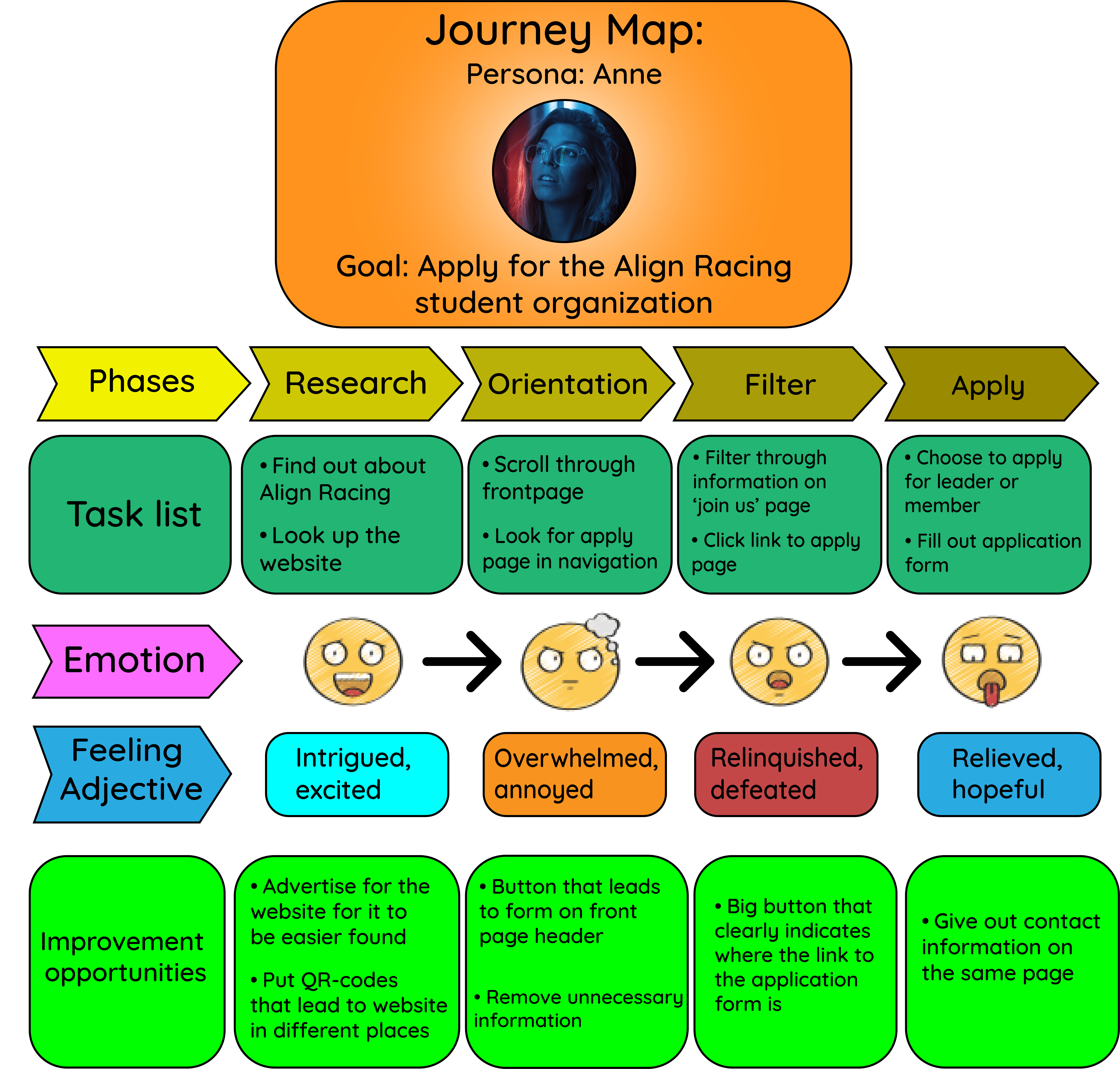
After performing a competitive audit, these were the takeaways.
Align Racing would have competitive advantages because…
1. Compared to other student organizations’ websites, their website will have better accessibility
2. The website will clearly represent the organization
3. The information that is on their website will be clear and relevant for their users
4. The website will be modern & responsive
5. It will be easy to apply to their organization as well as contacting them if needed
Major changes made for less user confusion
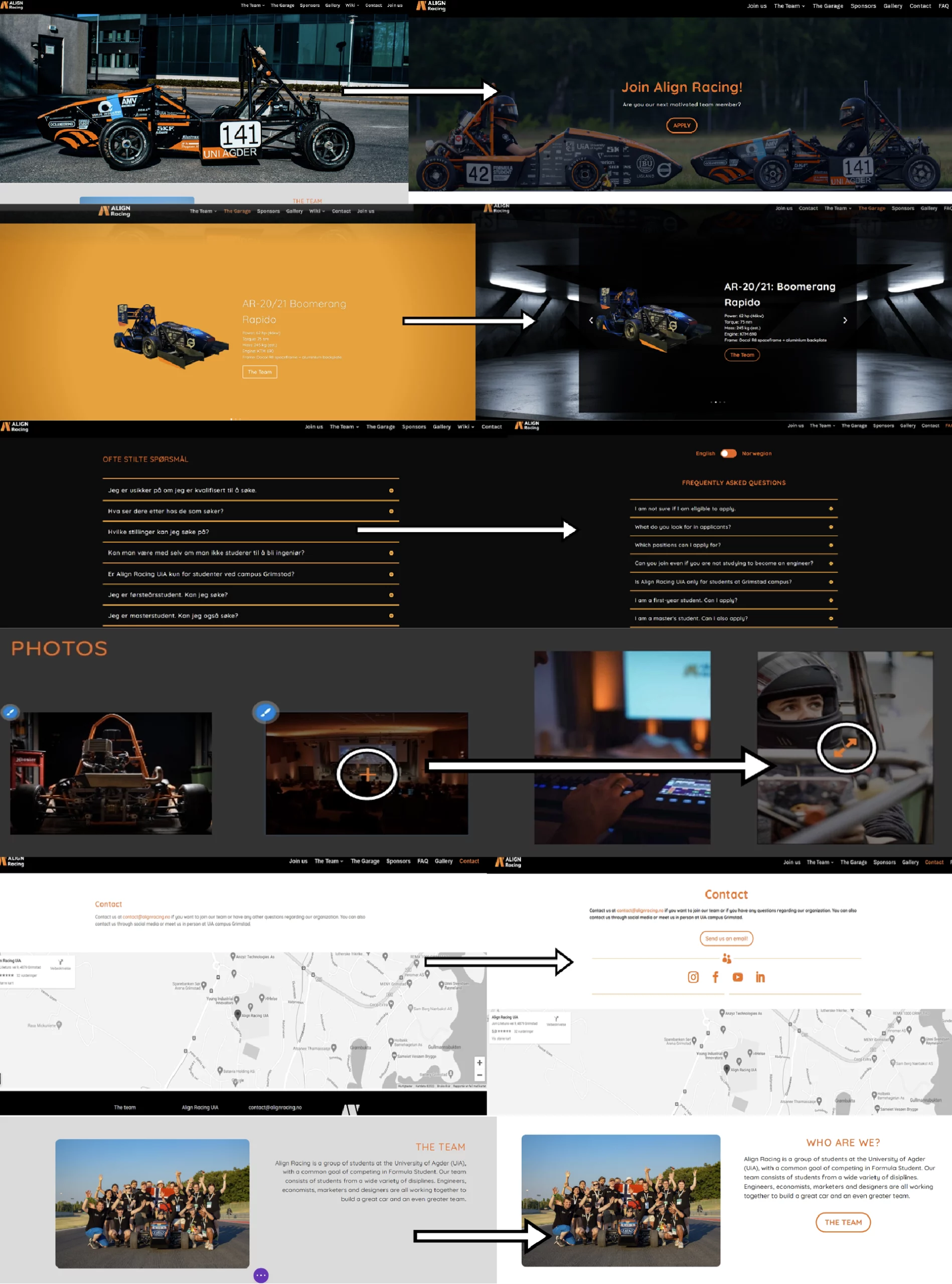
1. Sitemap. Changed the structure of the sitemap to better represent the main goal of the website. User research on the current website revealed that the ‘wiki’ section was causing confusion due to its complex language and unnecessary technical details about the car. It primarily catered to a niche audience and didn’t align with the organization’s goal of welcoming all university students. Additionally, the ‘wiki’ pages were placed higher in the hierarchy than the ‘Join Us’ page, implying higher importance. This discouraged potential new members from joining. To address these issues, the ‘wiki’ section from the site map was removed and the pages were reorganized based on their relevance and importance to improve the overall user experience and encourage new members to join.
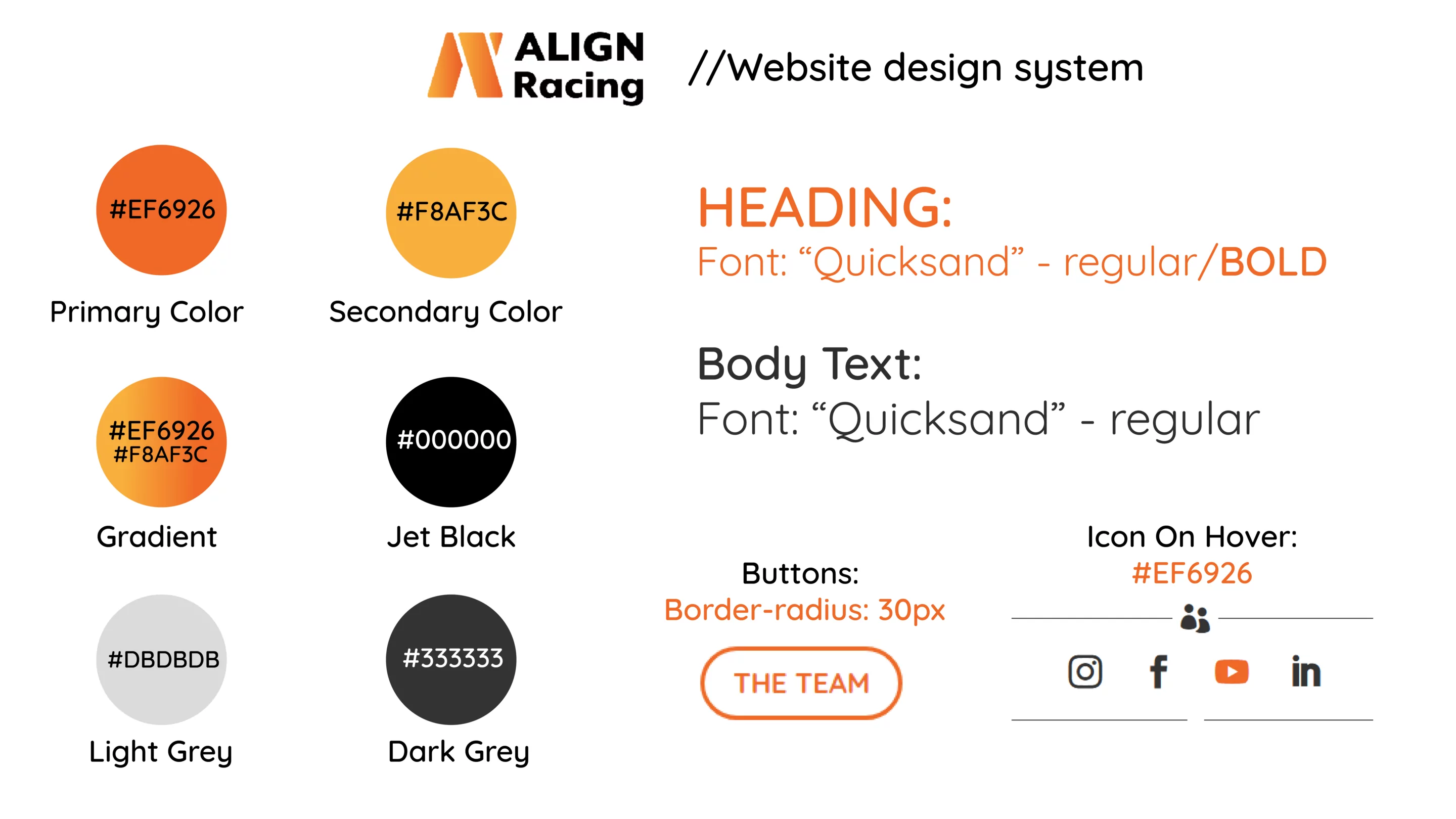
2. Changes in UI elements, fonts & colors. Made the colors more accessible with better contrast. Added different «On-Hover» elements to make it clear that some icons are links.
3. Icons. Some icons were changed to represent the function of the click better. For example, changed the “+” icon to an “Expand” icon on images. Social media links were also implemented in different pages for ease of contact.
4. Language. Made a «language»-changer when it came to those pages where it might be useful having the option of changing to the team’s native language. This included the «Join Us» page as well as the «FAQ» page.
5. Buttons. Added buttons to indicate where to clearly find useful links for the organization. This makes for easier navigation and elevates ease-of-use.

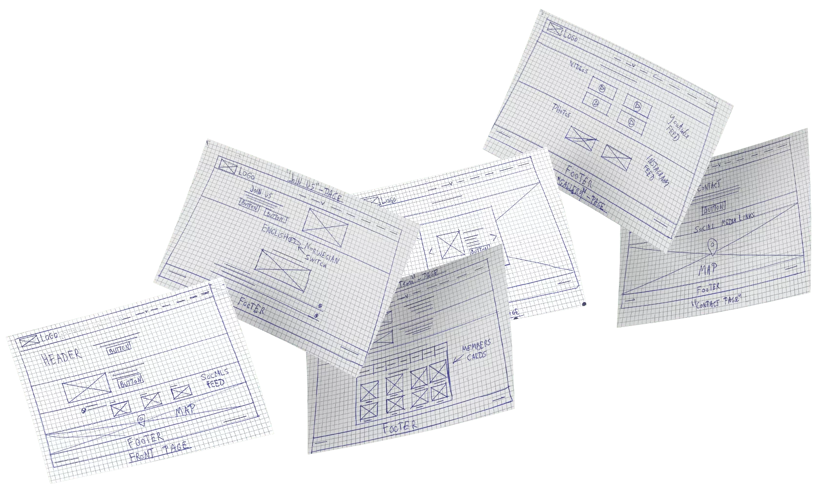
Wireframes
Before & After Redesign
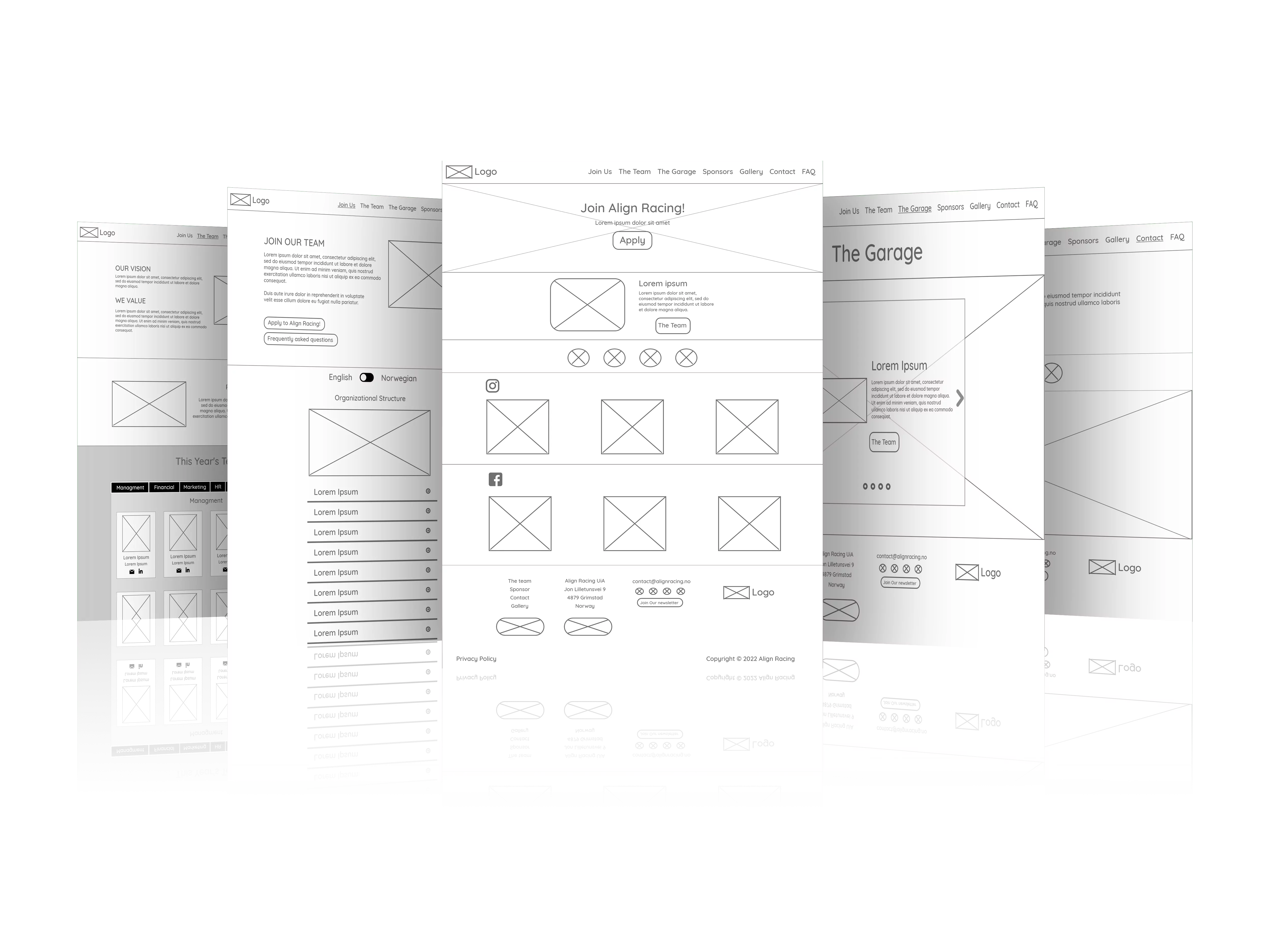
Prototype
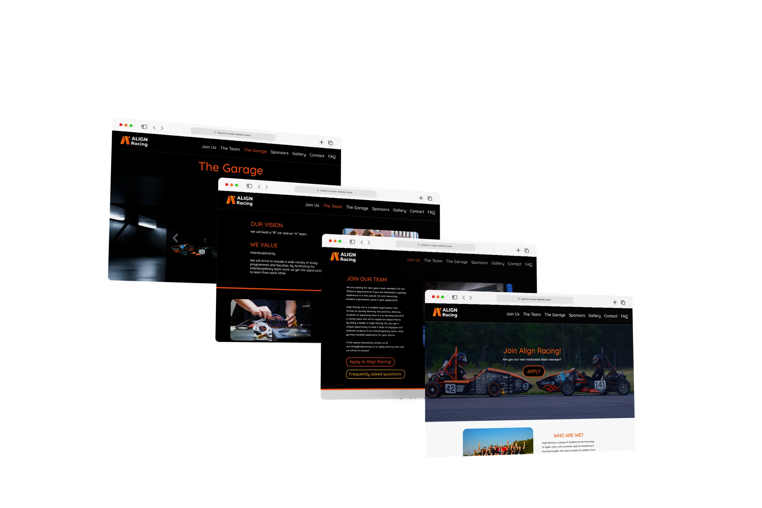
Final Product
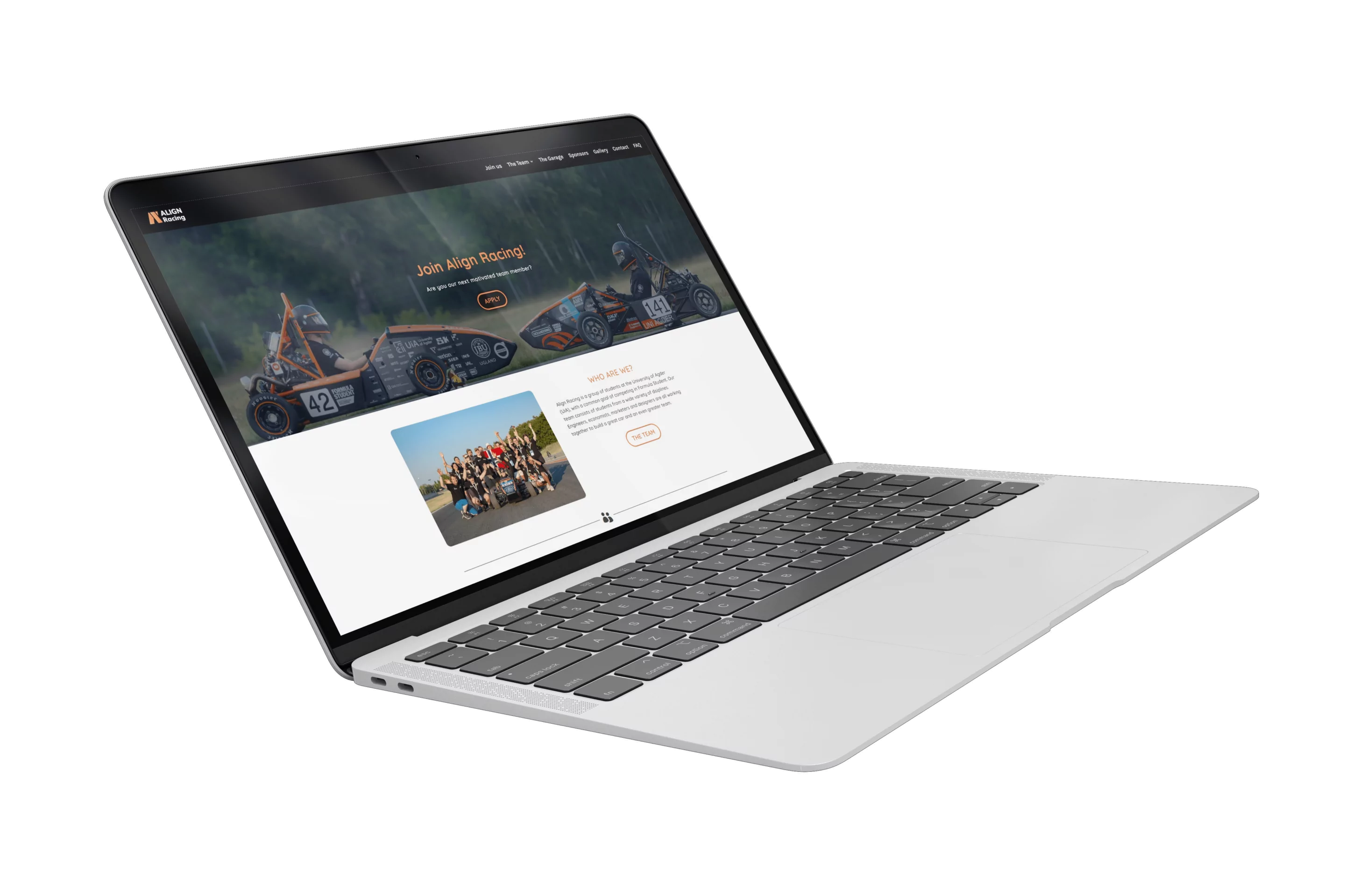
Impact
Ease-of-use
New visitors reported that the website was easy to use, and returning visitors reported that it now had easy navigation and a better structure compared to earlier.
Increased traffic
The organization got more traffic to the website, as well as more students applying for the team.
