AGDER GASS AS
Redesign of the company's graphic profile & website design/development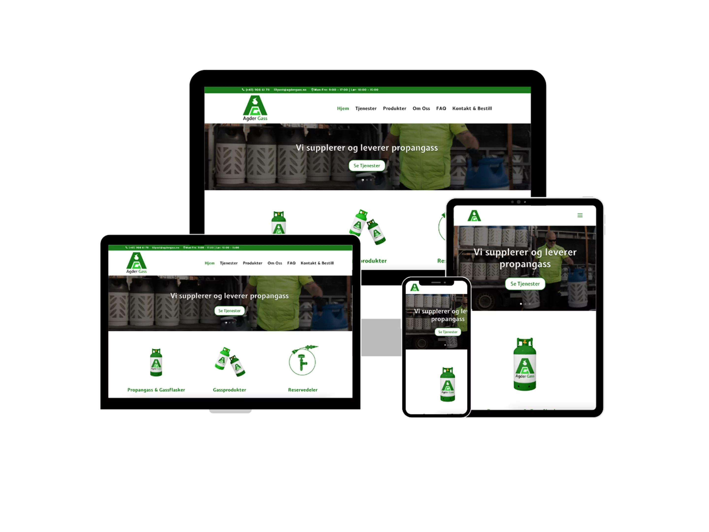
Who is Agder Gass?
Agder Gass AS offer customers propane gas and gas accessories at the lowest possible price. They focus on sustainability, with propane gas in mind. Their vision is good service, quality and safety, which is one of the reasons they also deliver products to their customers.
Some of the problems they face include that customers don’t know where they’re located and the lack of presence online.
Project Overview
Project Duration
3 Months: September – December 2022
The Problem
The company wanted to improve its online presence by making a website that would effectively reflect their values and products, in addition to desiring a graphic profile that better encapsulated their identity.
The Goal
A complete redesign of the company’s graphic profile & design/develop their website and make the company visible online.
My Role
Graphic/UX Designer & Web Developer.
Responsibilities
Redesign of the graphic profile, empathizing, research, wireframing, prototyping, developing, SEO, testing & website launch.
Tools
Adobe Illustrator, Adobe XD, WordPress with Divi Builder.
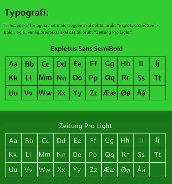
Graphic Profile
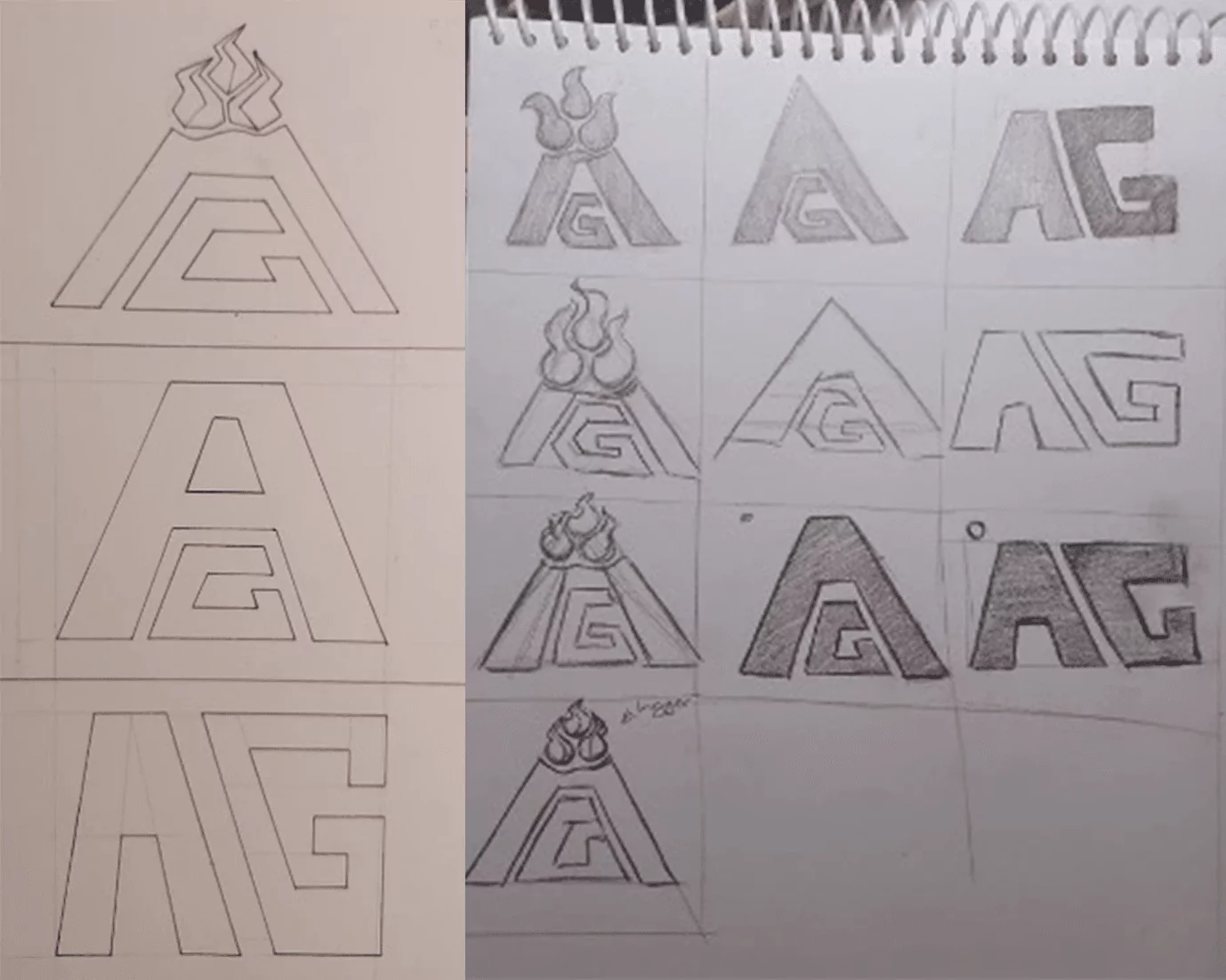
After numerous rounds of sketching, iterating, and refining, we crafted a logo that not only encapsulated the essence of the company and its vision but also exuded an elegant charm.
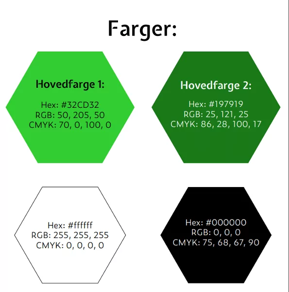
The colors were chosen with their contrast rates thoroughly tested for accessibility with WebAim’s Contrast Checker.
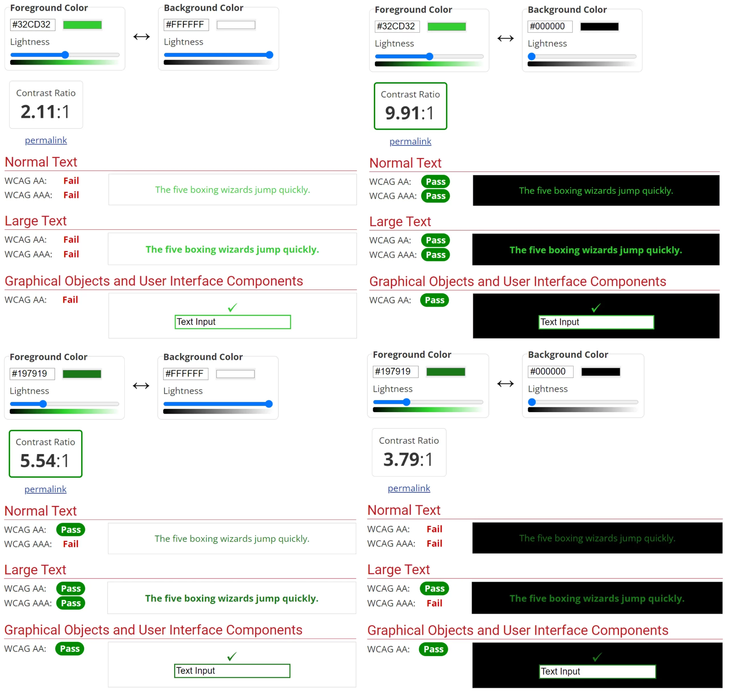
The main colors aim to represent the company’s environmentally friendly products.
USER RESEARCH: Summary
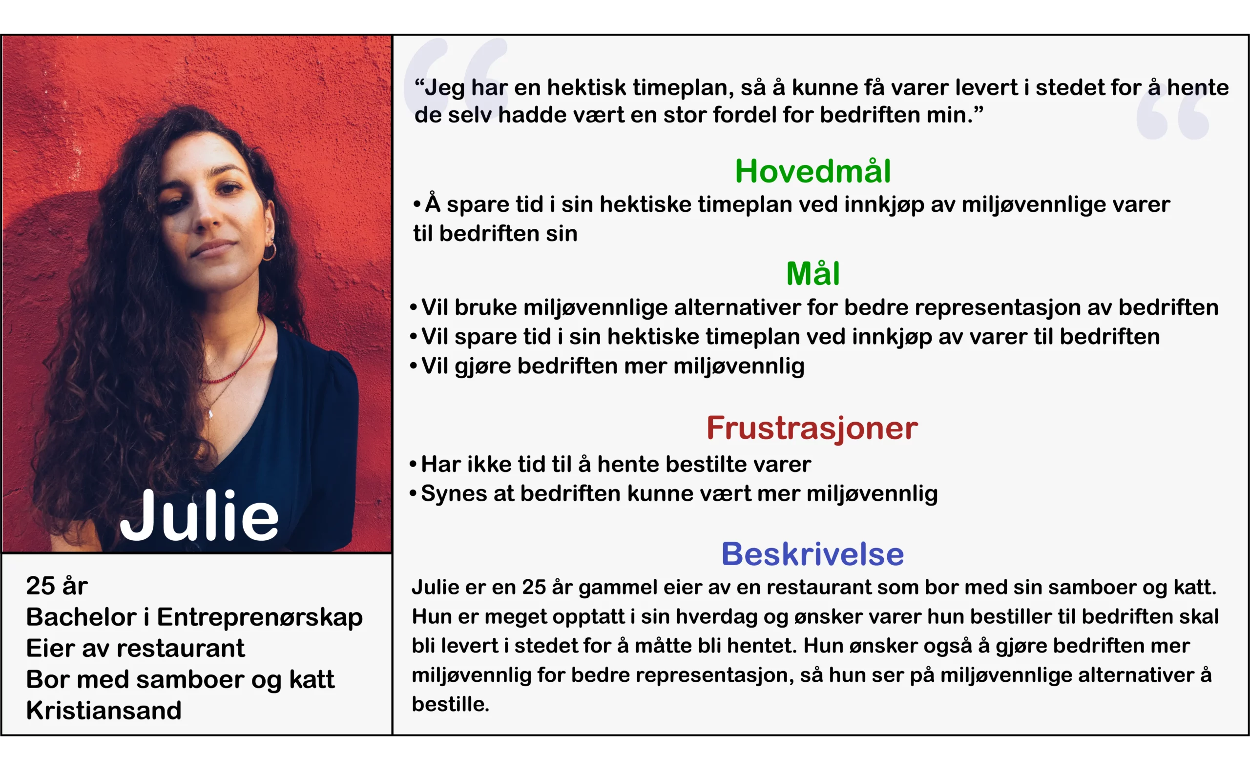
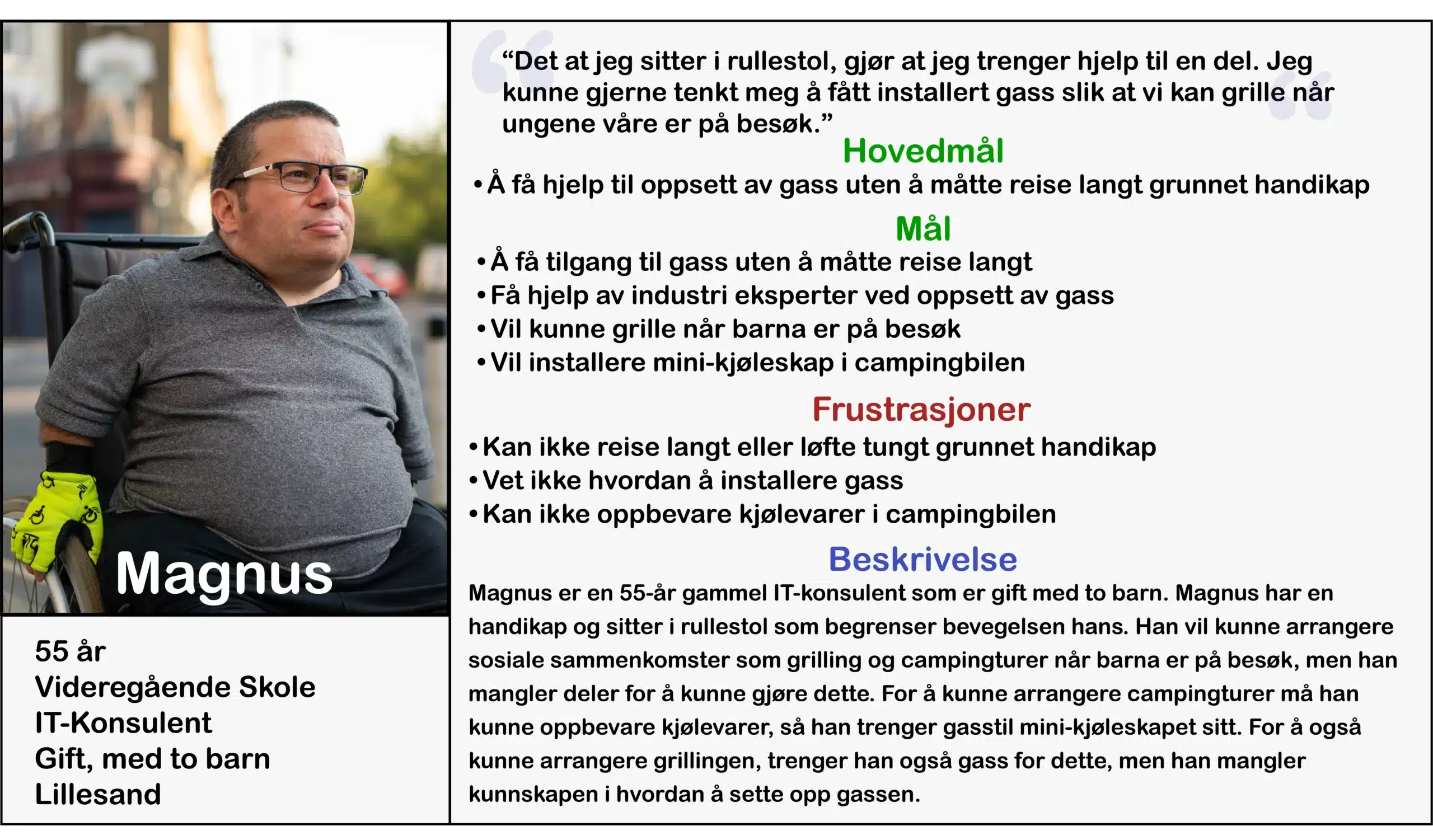
During this process we created personas based on research to understand the users we’re designing for and their needs.
Persona: Julie
Persona: Magnus
User Research Revealed Four Major Pain Points..
Time
Customers who buy gas do not always much time and often want it delivered.
Price
Buying gas is often too expensive if delivered.
Sustainability
Customers who buy gas often think about the environmental impact.
Accessibilty
Users need clear and easy-to-read instructions, good contrast of colors and ease-of ordering.
The primary user group identified through the research conducted ended up being customers between 25-55 years, who need easy access to buying propane gas and get it delivered.
USABILITY TESTING: Summary
A competitive audit was performed, as well as 2 usability tests. One was performed with the prototype and one with website itself.
• The second usability test was unmoderated and remotely conducted with a survey at the end. This had the function of testing the nearly finished website and to get more general feedback on the overall product, rather than the navigation and structure.
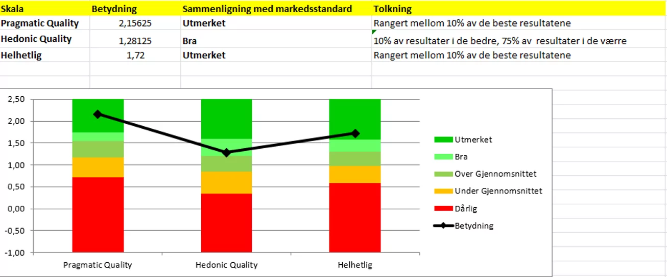
In addition to the questions in the survey, users also completed a System Usability Scale (SUS) based on the familiar User Experience Questionnaire (UEQ). SUS uses a scale of 1-7 for users to express their agreement level with specific statements about the product. This aims for a more accurate measurement of the overall user experience. The group chose the shortened UEQ version (UEQ-S) to get as honest responses as possible while still keeping the survey relatively short.
Using UEQ is a common and reliable method to gauge user experience without specific questions, promoting genuine, unbiased responses.
After both usability tests, useful findings were found which contributed to multiple changes made to the website when iterating.
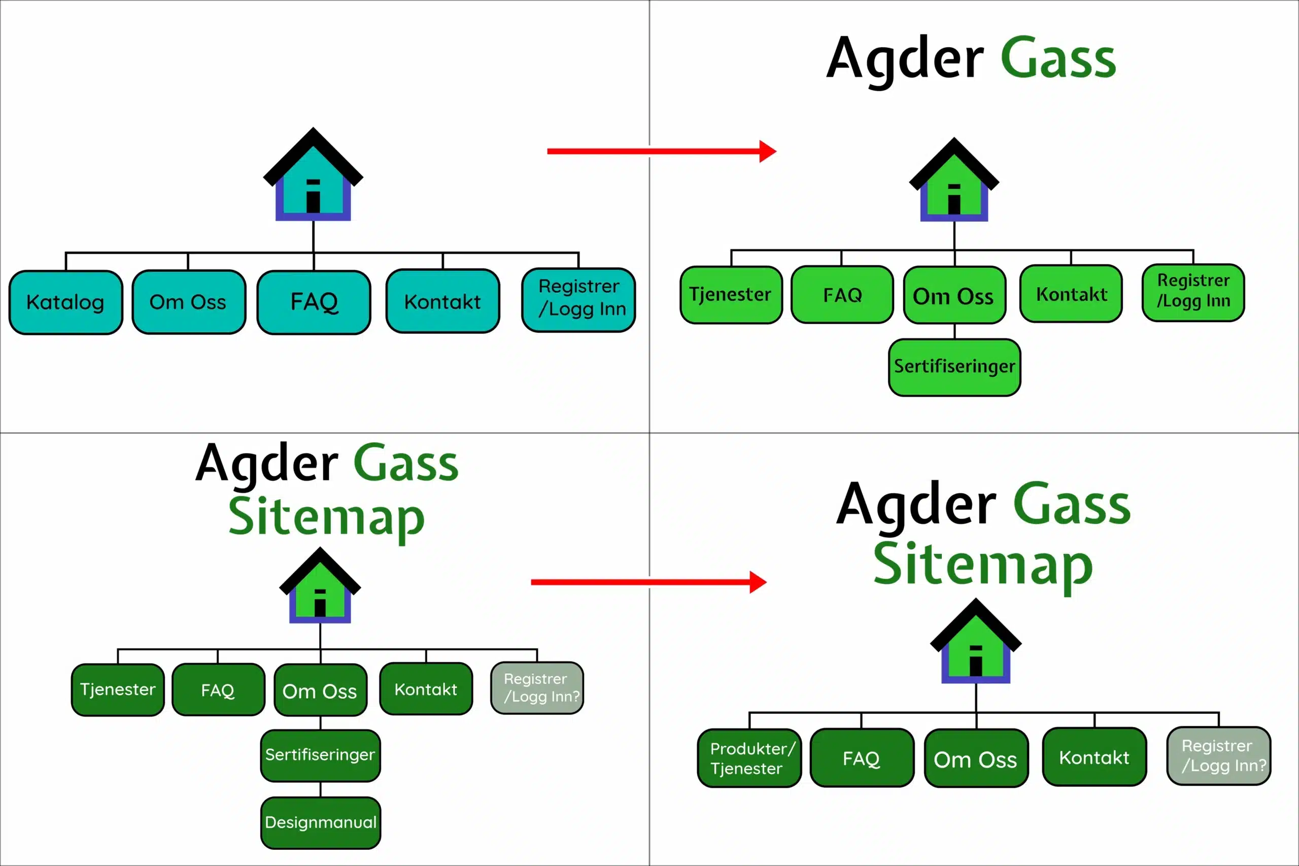
Sitemap
The sitemap underwent several changes following usability tests and feedback from the company.
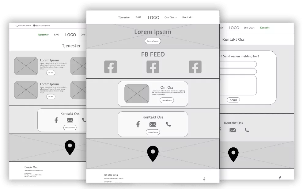
Wireframes & Protoype
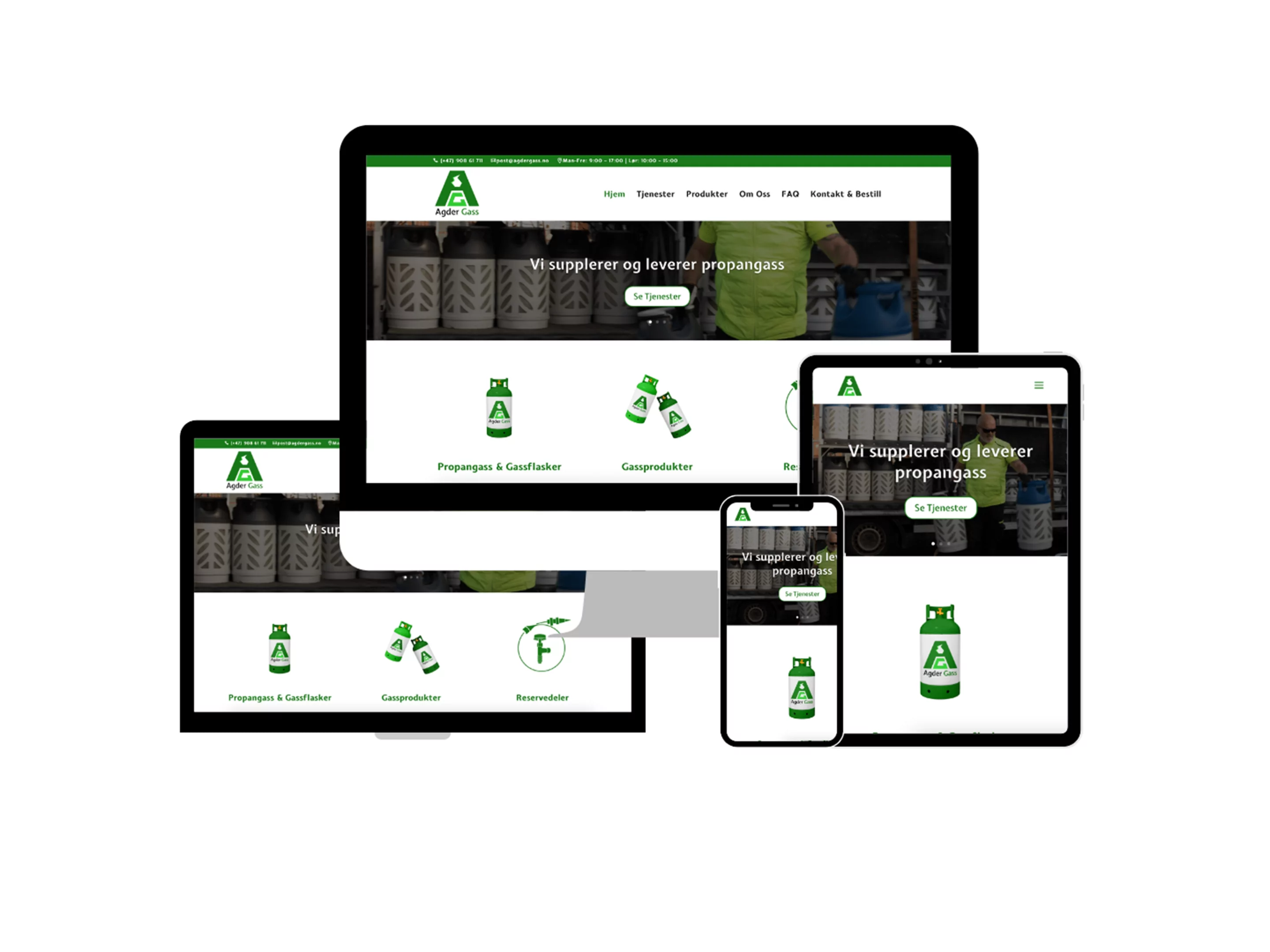
Final Product
Takeaways
Impact
The project had a significant impact on the company as it enabled customers to order gas online, as well as new customers also now could discover them online.
The company’s sales went up drastically, and returning customers reported back that the process of ordering is now much easier than before.
What I Learned
I learnt a lot during this project. I learnt a lot about cooperation, accessibility and iteration. I also learnt a lot about SEO and Google Maps/MyMaps, making the website visible on search engines as well as correcting their location on Google Maps.
