MYK
Mobile app design, content creation & development - Case Study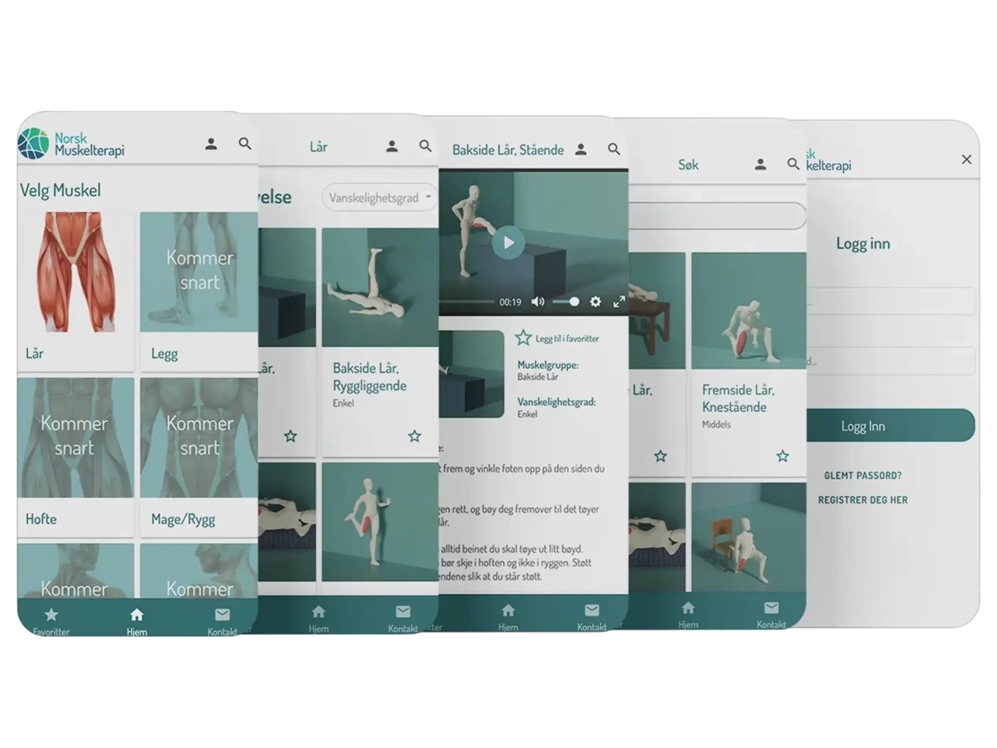
Project Overview
Project Duration
5 Months: January – May 2023
The Problem
Design, develop, test and launch a mobile app for company: ‘Norsk Muskelterapi’
The Goal
Design and develop an app for people to learn stretching-excercises
My Role
All UX Design Roles in a product design process & development & 3D Modeling/Animation
Responsibilities
Empathizing, Research, Wireframing, Prototyping, Developing, 3D-animation, App Launch
Tools
Figma, Adalo, Blender
User-Centered Design process
User-centered design puts the needs, preferences, and experiences of users at the forefront of the design process. It ensures that solutions are intuitive, effective, and enjoyable for the intended users, ultimately leading to products and services that meet real-world needs and have a higher chance of success in the market.
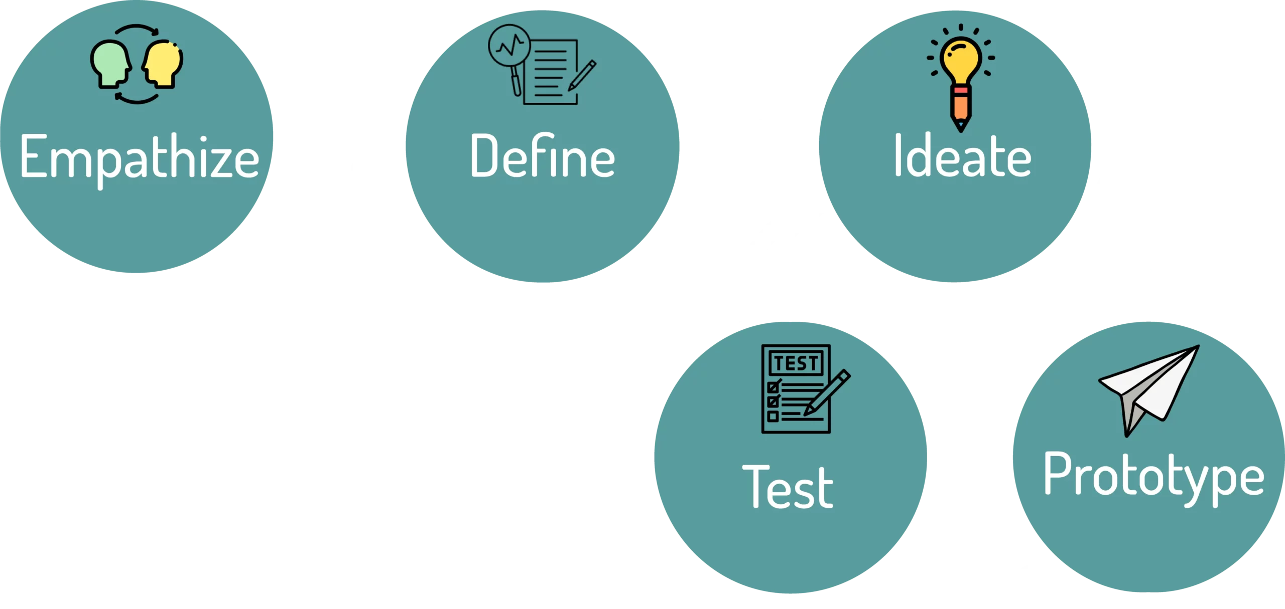
USER RESEARCH: Summary
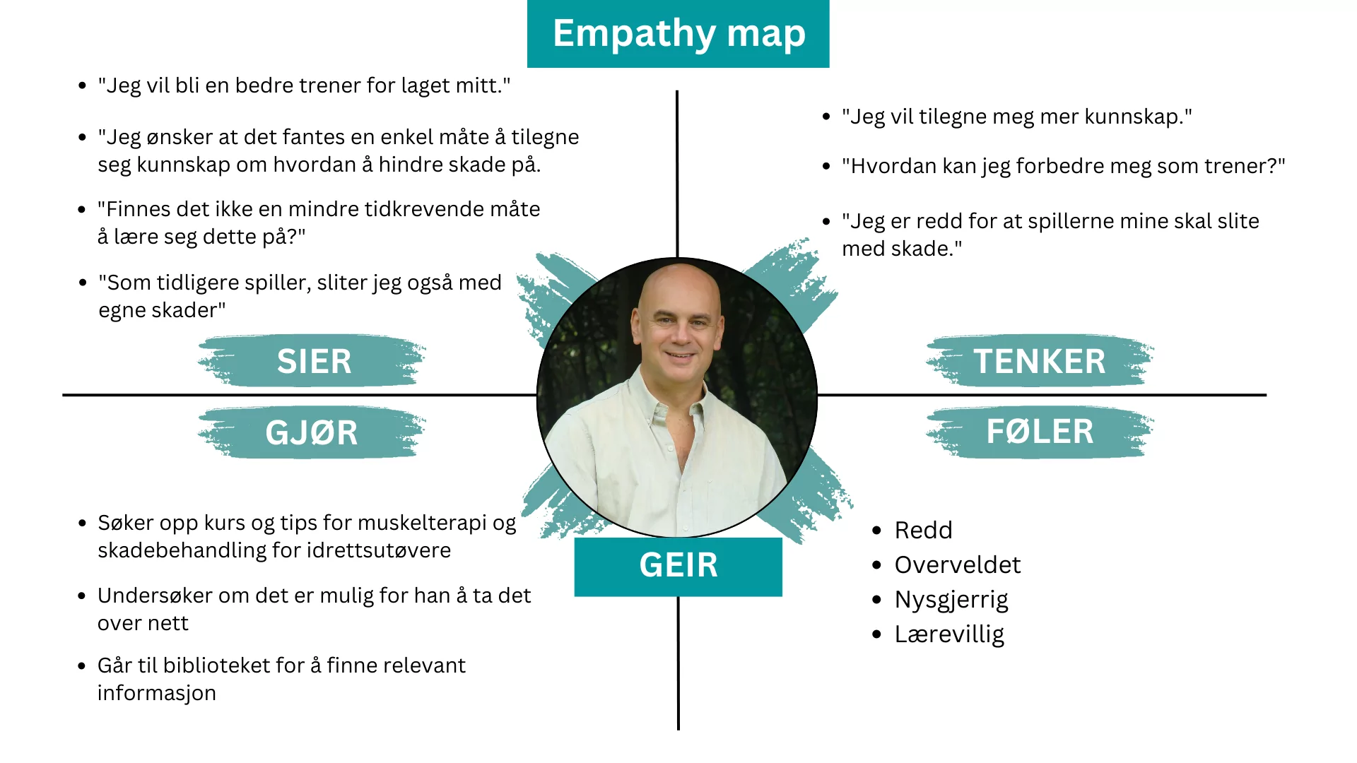
During this process we created an empathy map to understand the users we’re designing for and their needs.
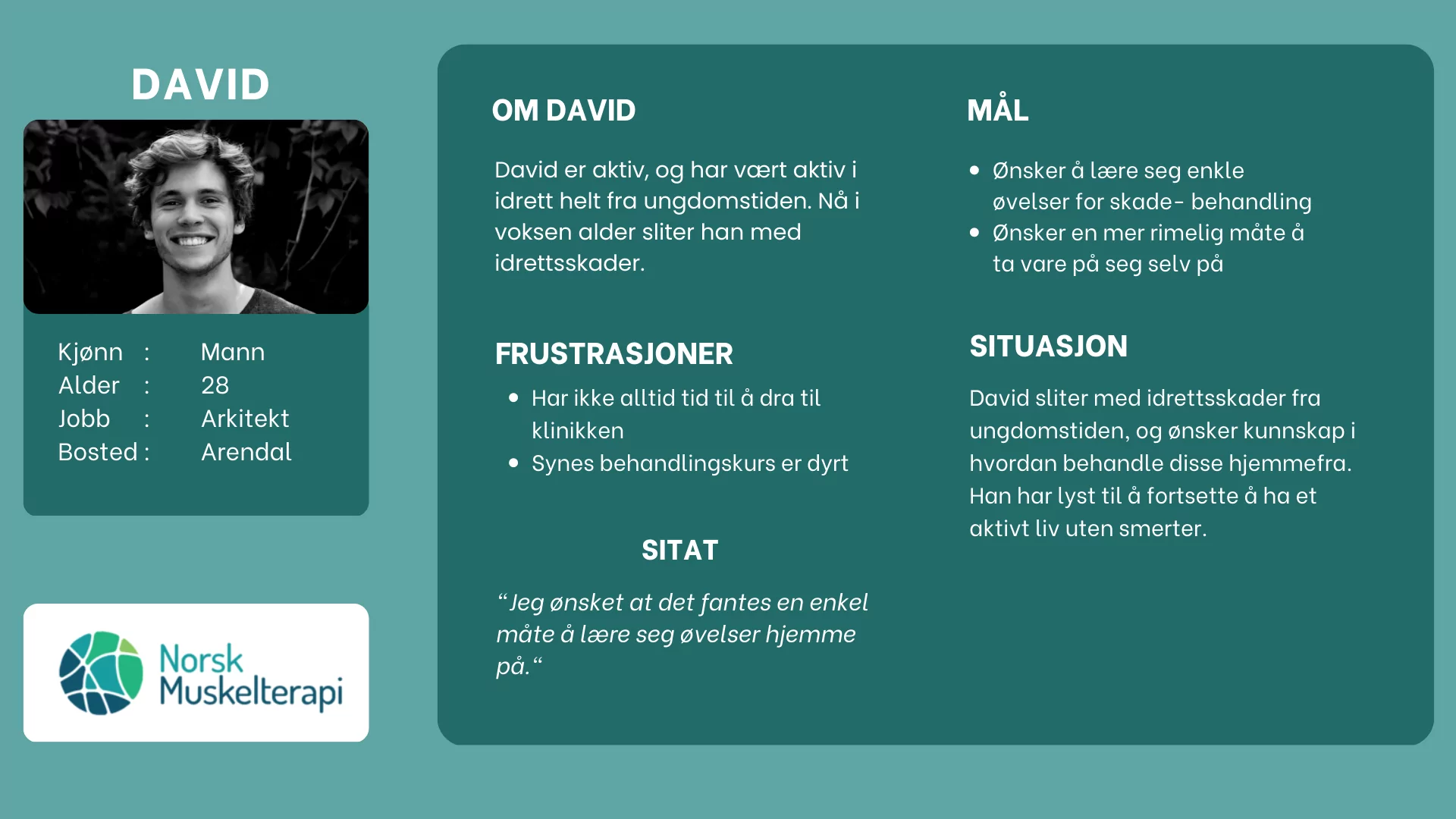
Persona: David
Persona: Tina
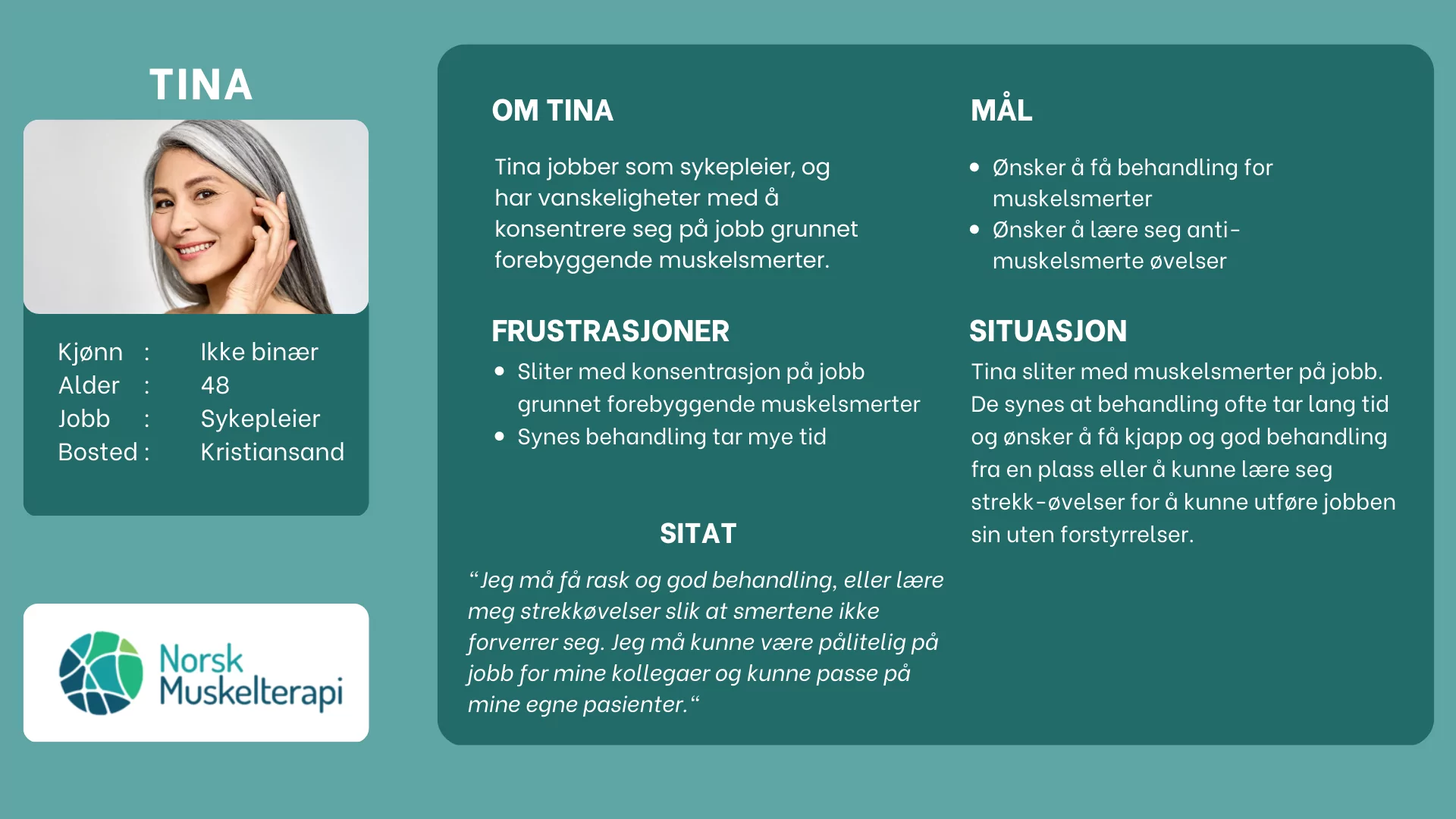
Persona: Geir
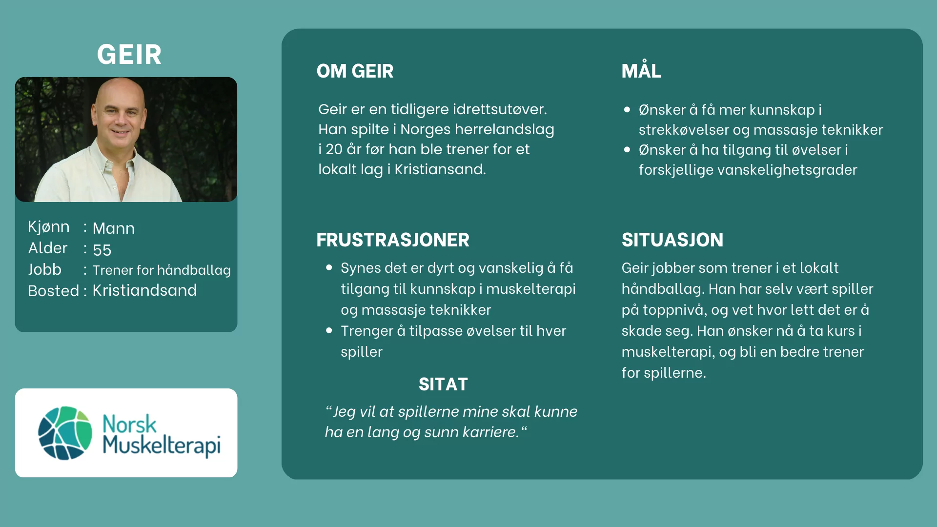
Persona: Berit
User Research Revealed Three Major Pain Points..
Time
Users that want to learn stretching excercises want to do it on-the-go.
Quick-access
Users need a way to quickly access their favourite exercises.
Accessibilty
Users need clear and easy-to-read instructions, good contrast of colors and multiple ways of learning the excercises.
The primary user group identified through the research conducted ended up being customers between 30-60 years, who need easy access to learning stretching exercises.
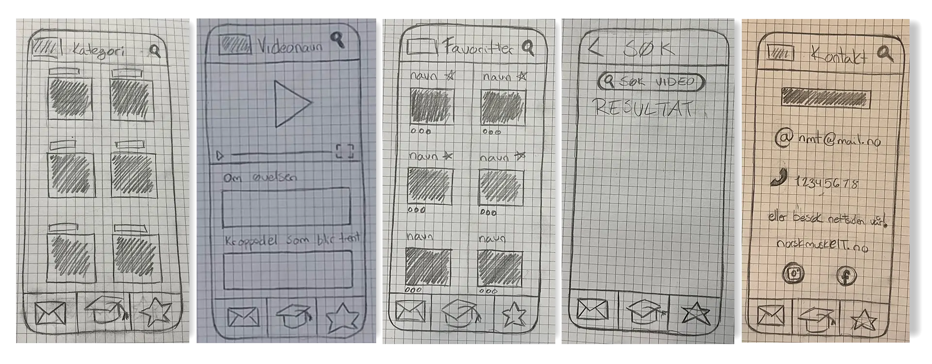
Paper Wireframes
USABILITY TESTING: Summary
A competitive audit was performed, as well as 2 usability testings, one on the prototype and one on the nearly-finished product.
The first usability test was moderatily conducted, and had the function of testing the application’s information architecture and main flow with a low-fidelity prototype designed in Figma.
The second usability test was moderatily conducted at the company’s clinic, and had the function of testing an almost finished application designed with Adalo with real customers.
Changes made after feedback from the first usability test:
The exercises were sorted by degree of difficulty. Easy first and difficult last. Users expressed they wanted the ability to favorite videos from the “Video details” page, which was then implemented. More focus on the exercise video and images of the muscles highlighted in exercise instead of text on the “Video details” page. Changed ‘book’-icon to a ‘house’-icon for “Home” page. Redesigned the entire “Contact” page.
Changes made after feedback from the second usability test:
A filtering system was created on the “Display exercises” page. A “Register” button was added to the “Login” page, next to the “Login” button. Titles above the input fields were added for less user confusion. The color of the navigation menu was changed to a darker color, which had the function of making text easier to read for the visually impaired.
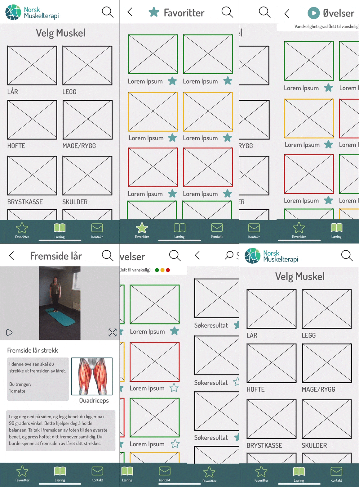
DIGITAL WIREFRAMES & prototype
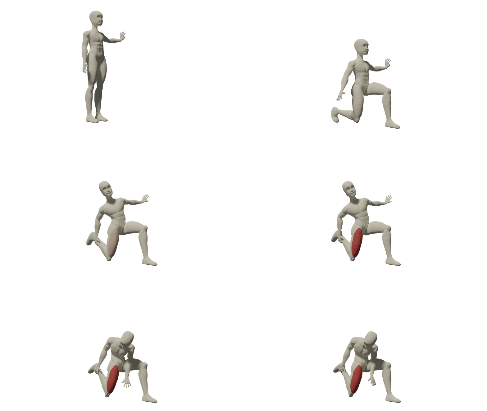
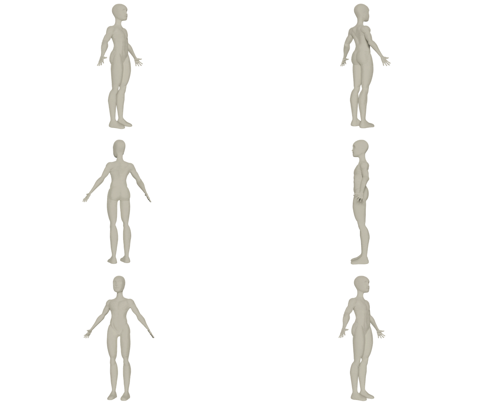
3D-Modelling, Texturing and Animation of the model for use in the exercise videos within the app.
Final Product
(Made with Adalo)

Takeaways
Impact
The project had a significant impact on the company as it enabled users to conveniently learn parts of their courses while on the move. Additionally, the company effectively showcased course materials to their audience and had a new way of marketing their company.
What I Learned
I learnt a lot during this project. I learnt how to use new software, the design and developing of a real application as well as the launchig process when launching an app to the Google Play Store. I also learnt a lot about team work, delegation and workflow during this project.
